Intro to Dplyr on nycflights13 (Updated Jan 18)
Introduction
In this entry I’m going to work through a sequence of analysis that will cover some of the main operations in dplyr. Dplyr is a tool in R that simplifies, and thus standardizes functions that you would generally perform on dataframes using base R functons. It will allow us to query the dataframe similar to what is possible in SQL.
The main operations in dplyr are:
- Select
- Filter
- Arrange
- Mutate
- Summarise
Let’s begin
We’re going to be looking at the nycflights13 dataset, which contains records of all the flights departing from NYC airports in 2013. Let’s take a look at the data:
library(nycflights13)
head(flights)
## Source: local data frame [6 x 16]
##
## year month day dep_time dep_delay arr_time arr_delay carrier tailnum
## (int) (int) (int) (int) (dbl) (int) (dbl) (chr) (chr)
## 1 2013 1 1 517 2 830 11 UA N14228
## 2 2013 1 1 533 4 850 20 UA N24211
## 3 2013 1 1 542 2 923 33 AA N619AA
## 4 2013 1 1 544 -1 1004 -18 B6 N804JB
## 5 2013 1 1 554 -6 812 -25 DL N668DN
## 6 2013 1 1 554 -4 740 12 UA N39463
## Variables not shown: flight (int), origin (chr), dest (chr), air_time
## (dbl), distance (dbl), hour (dbl), minute (dbl)To get started with the select function, let’s figure out a few ways select dep_time, dep_delay, arr_time, and arr_delay from flights.
#because they are side by side, we can do the following
select(flights, 4:7)
#if they weren't,  we could create a list:
select(flights, c(4,5,6,7))
#we can also list them out individually
select(flights, dep_time,dep_delay,arr_time,arr_delay)
#or using starts_with/ends_with
select(flights, starts_with("dep"),starts_with("arr"))
#or
select(flights, ends_with("delay"),ends_with("time"))
Let’s now try mutate. We can use this function in order to create new variables in our data frame.
Perhaps we can create a variable that will give us the total delay of the flights.
temp <- mutate(flights, total_delay= dep_delay + arr_delay)
select(temp, ends_with("delay"))
## Source: local data frame [336,776 x 3]
##
## dep_delay arr_delay total_delay
## (dbl) (dbl) (dbl)
## 1 2 11 13
## 2 4 20 24
## 3 2 33 35
## 4 -1 -18 -19
## 5 -6 -25 -31
## 6 -4 12 8
## 7 -5 19 14
## 8 -3 -14 -17
## 9 -3 -8 -11
## 10 -2 8 6
## .. ... ... ...g<-ggplot(data=temp)
g + geom_bar(map=aes(x=total_delay), fill="maroon") + xlim(-100,1000) + labs(title="A look at the distribution of delays")## Warning: Removed 9482 rows containing non-finite values (stat_count).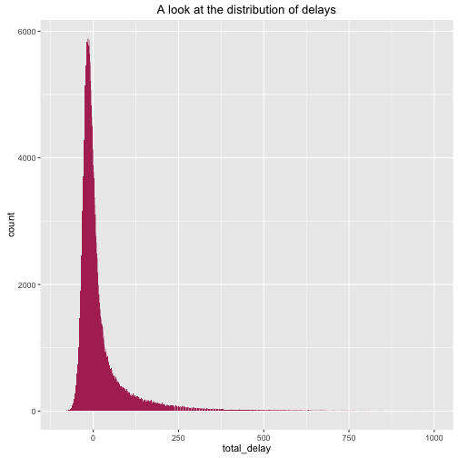
What we see is a right-skewed distribution. We can confirm this because the mean is: 19.4505325 which is larger than the median: -6, which indicates a right-skewed distribution.
Perhaps now we can look at all the flights with reasonable arrival and departing delays (e.g. let’s assume that 2 hrs is reasonable). We will do this by using the filter function supplied with dplyr.
ok_flights <- temp %>% filter(arr_delay<=2, dep_delay<=2)Moreover, you may have notice we used something new (%>%). This symbol tells us that we are using what’s on the left of it as the first parameter for the expression on the right, and is thus equivalent to:
ok_flights <- filter(temp, arr_delay<=2, dep_delay<=2)Now with this data set, we could ask: Which airlines have the most "acceptable" delays(including flights ahead of schedule)?.
ok_flights %>%
group_by(carrier) %>%
summarise(num_tot_delay = n()) %>%
arrange(desc(num_tot_delay))
## Source: local data frame [16 x 2]
##
## carrier num_tot_delay
## (chr) (int)
## 1 UA 28840
## 2 DL 28489
## 3 B6 27855
## 4 EV 24782
## 5 AA 19472
## 6 MQ 13291
## 7 US 12396
## 8 9E 9374
## 9 WN 5394
## 10 VX 2737
## 11 FL 1210
## 12 AS 467
## 13 YV 269
## 14 HA 234
## 15 F9 224
## 16 OO 18In this example we made use of multiple pipes. Moreover, we introduced the group_by() function, which was used to the dataframe into subsets based on the carrier. We then looked at the average total delay for all the flights for each different airline using the summarise() function. Lastly, we used the arrange() function in order to look at the flights with the most “acceptable” delays. In fact we do see UA and DELTA which are probably handle the most traffic, and thus this analysis might not actually tell us much about the quality of their services.
If we were to use ok_flights, a more appropriate question would be to see which carrier had the shortest delays on average, given that they were acceptable flights.
ok_flights %>%
group_by(carrier) %>%
summarise(mean_tot_delay = mean(total_delay)) %>%
arrange(mean_tot_delay)
## Source: local data frame [16 x 2]
##
## carrier mean_tot_delay
## (chr) (dbl)
## 1 AS -32.29764
## 2 HA -27.57265
## 3 9E -24.38127
## 4 VX -23.74205
## 5 AA -23.31697
## 6 YV -22.96654
## 7 OO -21.94444
## 8 UA -21.18221
## 9 DL -21.07224
## 10 EV -19.07062
## 11 US -18.81534
## 12 B6 -18.65148
## 13 MQ -18.32812
## 14 F9 -18.04911
## 15 WN -17.51483
## 16 FL -15.52893One last thing we could do is to look at the previous bar graph, and create one that symbolizes what proportion of flights were acceptable in a visual manner, although we can see this from the original, let’s just make use of some cool settings in ggplot.
#first we need to create a new variable that indicates whether a flight was
#indeed an acceptable flight
temp2 <- mutate(temp, acceptable = (arr_delay<=2 & dep_delay<=2))
g2<-ggplot(data=temp2)
g2 + geom_bar(mapping=aes(x=total_delay,fill=acceptable)) + xlim(-100,1000) + labs(title="A look at the distribution of delays")
## Warning: Removed 9482 rows containing non-finite values (stat_count).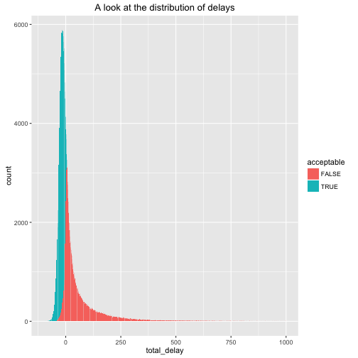
Woah, this is kind of weird, there are some un-acceptable flights with total delays less than 0. But remember the conditions for an acceptable flight were no arrival or departure delays longer than 2 hours; However some of these flights indicate cases where for example, dep_delay = 5, but arr_delay=-10. phew!. However, now the question is whether our conditions for acceptability are valid, because of their inconsistency with total_delay, but that’s a question we’ll leave for the moment.
In closing
We took a brief look at the operations included in the dplyr package, and how simple it was for us to do some initial exploratory analysis on the data set.