Analysing nycflights13 Using Relational Structure of its DataFrames (Updated)
Introduction
In this post we’ll be usig the nycflights13 data again, and this is because it has many other dataframes within it, so that we can use some of dplyr’s relational function.
In fact there are the following datasets within this package:
-
flightswhich contains information about all the flights out of New York, and is the most central df airportswhich gives us information regarding the airports, ie:the name and locationplaneswhich gives us information regarding particular planes, used inflightsairlinesgives information regarding airlinesweatherwhich gives us the weather conditions at the departing city/aiport in New York.
In this post we’ll take a look at flights, planes, and airports in the following 2 questions.
Let’s begin
So the first question we’ll take a look at is:
- Compute the average delay by destination, then join on the airports data frame so you can show the spatial distribution of delays.
flights2 <- mutate(flights, tot_delay = arr_delay + dep_delay)
flights2 <- flights2 %>% group_by(dest) %>%
  summarise(avg_delay = mean(tot_delay, na.rm = T)) %>%
  left_join(airports, c("dest"="faa")) %>%
  arrange(desc(avg_delay))

head(flights2)
## Source: local data frame [6 x 8]
##
## dest avg_delay name lat lon alt tz
## (chr) (dbl) (chr) (dbl) (dbl) (int) (dbl)
## 1 CAE 75.57547 Columbia Metropolitan 33.93883 -81.11953 236 -5
## 2 TUL 68.54762 Tulsa Intl 36.19839 -95.88811 677 -6
## 3 OKC 59.80000 Will Rogers World 35.39309 -97.60073 1295 -6
## 4 JAC 55.57143 Jackson Hole Airport 43.60733 -110.73775 6451 -7
## 5 TYS 52.45156 Mc Ghee Tyson 35.81097 -83.99403 981 -5
## 6 BHM 45.89219 Birmingham Intl 33.56294 -86.75355 644 -6
## Variables not shown: dst (chr)Now we’re ready to visualize this information. First let’s make a plot of the United States, as it seems the flights only include flights to other American cities. We use the map data included with the ggplot2 package, and we we set the variable states to the dataframe that includes the coordinates to plot each state.
We then use geom_polygon in order to plot the map using the coordinate information.
library(ggplot2)
states = map_data("state")

g <- ggplot(data=states)
g2 <- g + geom_polygon(mapping=aes(x=long,y=lat,group=group),color="white",fill="grey")
g2 <- g2 + ggtitle("Map of the USA minus Alaska")
g2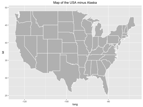
Let’s now add the information regarding which destination airports are the cause of most delay. Let’s remove the points that are too west to be plotted onto this map, (ie: all airports in Alaska).
flights3 <- filter(flights2, lon > -140)
g3 <- g2 + geom_point(data=flights3, mapping = aes(x = lon, y = lat, color = avg_delay),
                position = "jitter",size=2.5) + labs(color = "Average Delay") +
                scale_colour_gradient(low = "white",high = "dark red")
g3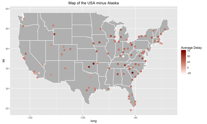
Let’s make this even more detailed by adding some labels to the worst, and best destinations.
#let's remove the na terms, because they will cause some trouble for the tail function later on.
#note: probably should've removed the na terms far earlier on.

flights3 <- filter(flights3, !is.na(avg_delay))
worst_flights <- head(flights3,5)
best_flights <- tail(flights3,5)

g4 <- g3 + geom_text(data=worst_flights, mapping=aes(x = lon, y = lat, label = dest), color="red", nudge_y = -0.5)

g4 + geom_text(data=best_flights, mapping=aes(x = lon, y = lat , label = dest), angle=20,nudge_y=-0.5)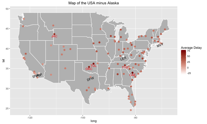
As an added bonus, we’ll plot this information(including those points too Western for the ggplot map of the USA) using plotly.
flights2$hover <- with(flights2, paste0(name,', Avg. Delay: ',avg_delay))

m <- list(
  colorbar = list(title = "Average Delay"),
  size = 9, opacity = 0.7, symbol = 'circle'
)

# geo styling
g <- list(
  scope = 'usa',
  projection = list(type = 'albers usa'),
  showland = TRUE,
  landcolor = toRGB("gray95"),
  subunitcolor = toRGB("gray85"),
  countrycolor = toRGB("gray85"),
  countrywidth = 1,
  subunitwidth = 0.5
)


usa <- plot_ly(flights2, lat = lat, lon = lon, text = hover, color = avg_delay,
        type = 'scattergeo', locationmode = 'USA-states', mode = 'markers',
        marker = m) %>% layout(title = 'Delays of US airports, flying out of NYC', geo = g)

usa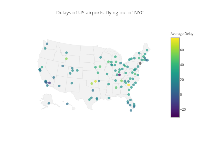
Second Question now is:
- Is there a relationship between the age of a plane and its delays?
So for this we are using the year the plane is made as a proxy for age, ie: latest models are the youngest planes.
Answering this question now requires us to join the planes table with the flights table in a similar fashion as we did before:
flights_planes <- mutate(flights, tot_delay = arr_delay + dep_delay)

flights_planes <- flights_planes %>% group_by(tailnum) %>%
  summarise(avg_delay = mean(tot_delay, na.rm = T), num_of_flights = n() ) %>%
  left_join(planes, by="tailnum") %>%
  arrange(desc(avg_delay))

head(flights_planes)
## Source: local data frame [6 x 11]
##
## tailnum avg_delay num_of_flights year type
## (chr) (dbl) (int) (int) (chr)
## 1 N844MH 617 1 2002 Fixed wing multi engine
## 2 N911DA 562 1 1995 Fixed wing multi engine
## 3 N922EV 550 1 2003 Fixed wing multi engine
## 4 N587NW 536 1 2002 Fixed wing multi engine
## 5 N851NW 452 1 2004 Fixed wing multi engine
## 6 N654UA 412 1 1992 Fixed wing multi engine
## Variables not shown: manufacturer (chr), model (chr), engines (int), seats
## (int), speed (int), engine (chr)#let's remove all the planes that haven't flown more than 100 times, and any missing values.
flights_planes2 <- filter(flights_planes, num_of_flights>=100, !is.na(avg_delay), !is.na(year))
g_planes <- ggplot()
g_planes + geom_jitter(data=flights_planes2, mapping = aes(x=year,y=avg_delay)) + geom_smooth(data=flights_planes2, mapping = aes(x=year, y=avg_delay), method = "lm") + xlab("Year") + ylab("Average Delay") + ggtitle("Year of Plane vs Average Delay") + geom_smooth(data=flights_planes2, mapping=aes(x=year,y=avg_delay), color="red", se=F)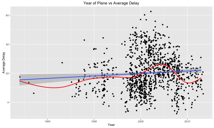
From the looks of the plot, it doesn’t really seem like there’s a relationship. The average delay times are all fairly spread out for all the years with a lot of planes, there does seem to be a lot more variation in the early 2000s compared to the years following however.
However I plotted the blue line, which represents a linear model (avg_delay ~ year), and it seems to signal a positive relationship between the two variables. We can further examine the model to see if this is valid.
model <- lm(avg_delay~year,data=flights_planes2)
summary(model)
##
## Call:
## lm(formula = avg_delay ~ year, data = flights_planes2)
##
## Residuals:
## Min 1Q Median 3Q Max
## -29.065 -9.303 -1.536 7.916 42.411
##
## Coefficients:
## Estimate Std. Error t value Pr(>|t|)
## (Intercept) -318.72454 139.19931 -2.290 0.0222 *
## year 0.16929 0.06954 2.434 0.0151 *
## ---
## Signif. codes: 0 '***' 0.001 '**' 0.01 '*' 0.05 '.' 0.1 ' ' 1
##
## Residual standard error: 12.73 on 1097 degrees of freedom
## Multiple R-squared: 0.005373, Adjusted R-squared: 0.004466
## F-statistic: 5.926 on 1 and 1097 DF, p-value: 0.01508We see that the p-value for the coefficient for year is actually significant, and is equal to 0.16929, which is again quite negligile in practical terms. In addition, the r-squared of the model is: summary(model)$r.squared which indicates an extremely poor model, and thus it’s evidence against a linear relationship between year of the plane and average delay. In addition we also tried a polynomial model(indicated in red), but that returned a poor r-squared as well. Thus I don’t believe that there’s a practical relationship between the age of the plane the delays they face, at least for the data that is present in the nycflights13 dataset.
Conclusion
In this post we used join functions in the dplyr package in order to generate new data frames for our analysis. We were able to use this information to visualize delays by airports via a map of the USA, and we were able to answer the question of whether or not the age of the plane had an influence of the average delay time of the plane.