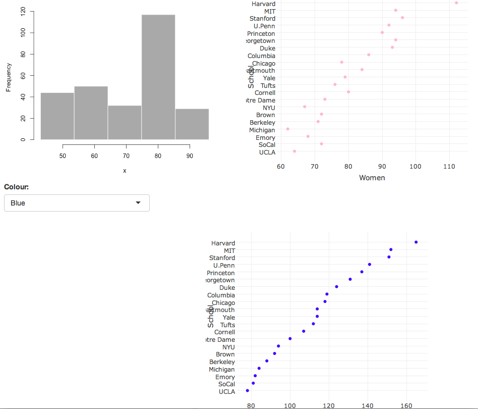
Shiny Dashboard
This is some code in R/Shiny that will also provide a layout similar to that of that of the one done using Plotly. However we plot different graphs, and replace one of the graphs with a drop-down menu that adjusts the colour of the markers.
library(shiny)
library(plotly)

s <- read.csv("https://raw.githubusercontent.com/plotly/datasets/master/school_earnings.csv")
s <- s[order(s$Men), ]


ui <- fluidPage(

  fluidRow(
    column(6,plotOutput("Plot1")),
    column(6,plotlyOutput("Plot2"))
  ),

  fluidRow(
    column(4,
           selectInput("colour", "Colour:",
                       c("Blue" = "blue",
                         "Pink" = "pink"))
    ),
    column(6,plotlyOutput("Plot3"), offset=5)
  )

)

server <- function(input, output) {

  output$Plot1 <- renderPlot({

    # generate bins based on input$bins from ui.R
    x    <- faithful[, 2]
    bins <- seq(min(x), max(x), length.out = 5 + 1)

    # draw the histogram with the specified number of bins
    hist(x, breaks = bins, col = 'darkgray', border = 'white')

  })

  output$Plot2 <- renderPlotly({

    plot_ly(s, x = Women, y = School, name = "Women",
            mode = "markers", marker = list(color = "pink"))
    })

  output$Plot3 <- renderPlotly({

    plot_ly(s, x = Men, y = School, name = "Women",
            mode = "markers", marker = list(color = input$colour))
    })
}

shinyApp(ui = ui, server = server)
###Below is an image of the output.